Phase 1: Gathering resources
07/03/2023
Materials
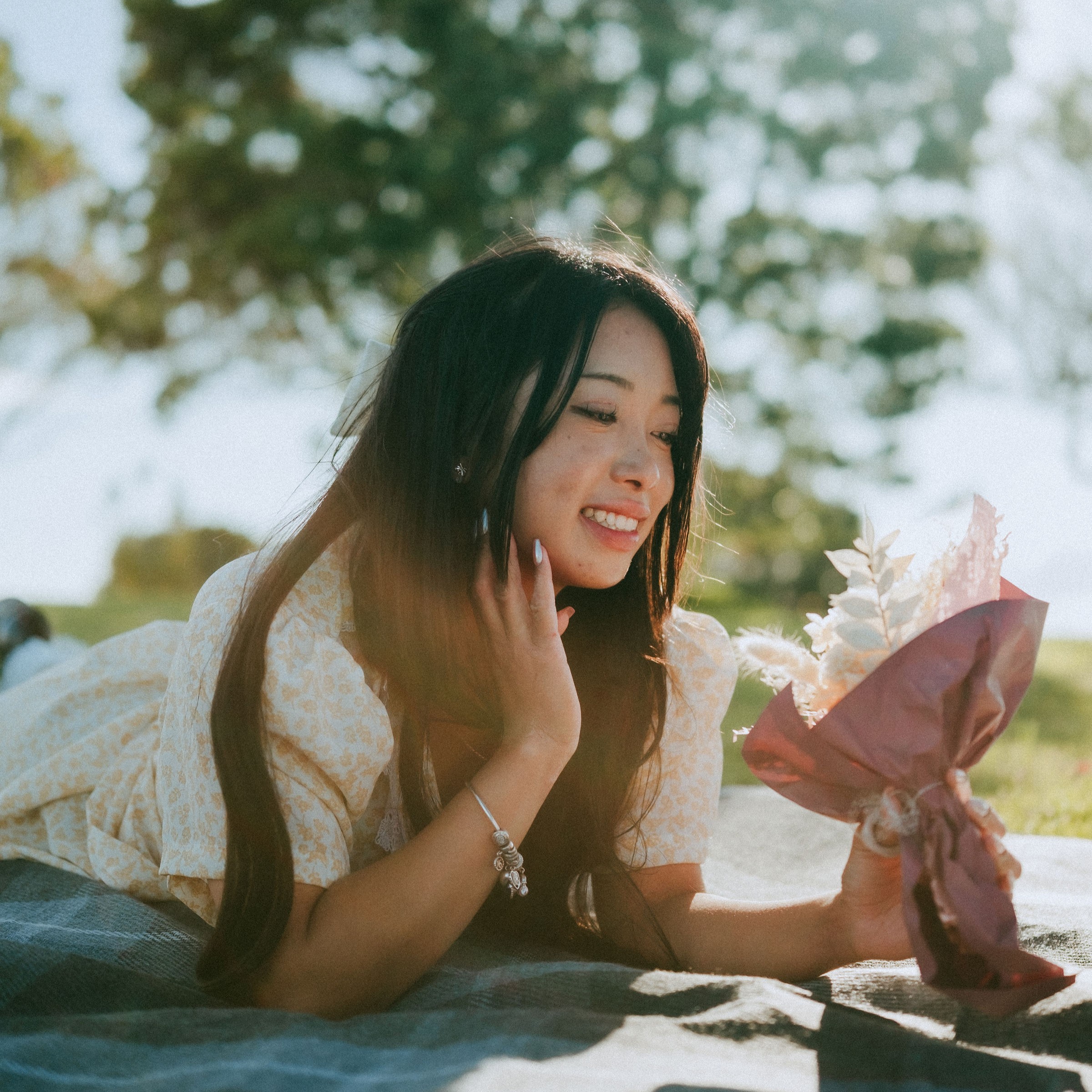
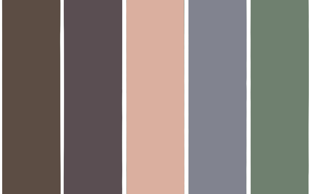
Today, we put together our materials. I brought fashion magazines and ribbons. I tried my best to think what I like and the colour palette. I also played with the colours for this display. Something that stands out is the cat. It’s kind of out of place but it still connects with these images.

Here’s a mini colour palette for this display.
Phase 2: Visual dialogues
13.03.23
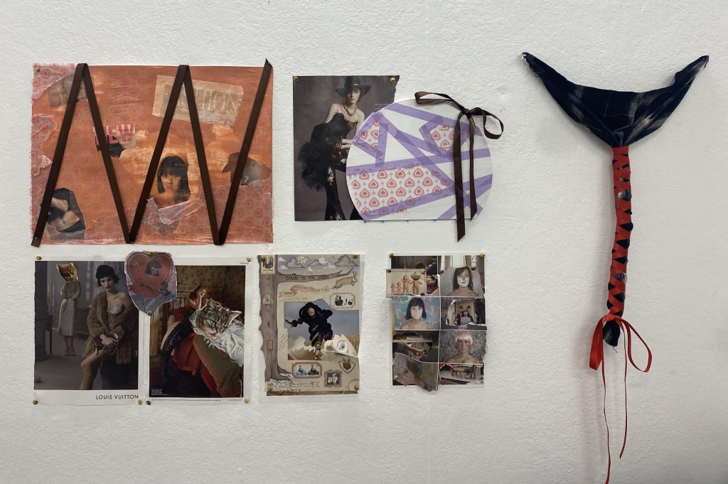
Using the materials from phase 1, I created and experimented different techniques. There are various uses of collage and framing. I made a few of the collages pop out using long pins on the wall. Staining gift wrapping paper and cut outs, created a authentic look on the paper. I experimented with the use of ribbons and fabric. On the right, I tried making it look like a ballet pointe shoe ribbon.
Printmaking workshop
15.03.23
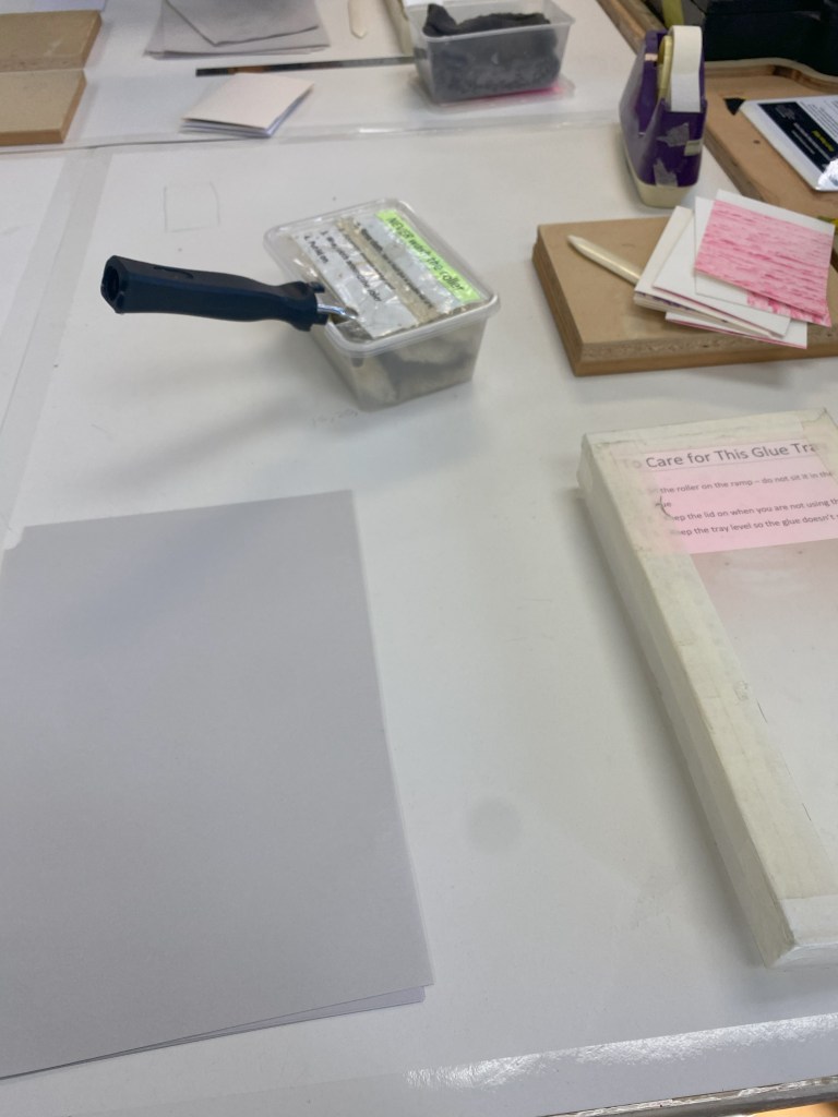
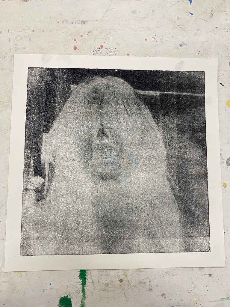
In this printmaking workshop, we learnt two processes. First, we were taught the drypoint etching. We cleaned the metal and applied the ink on the heated table.
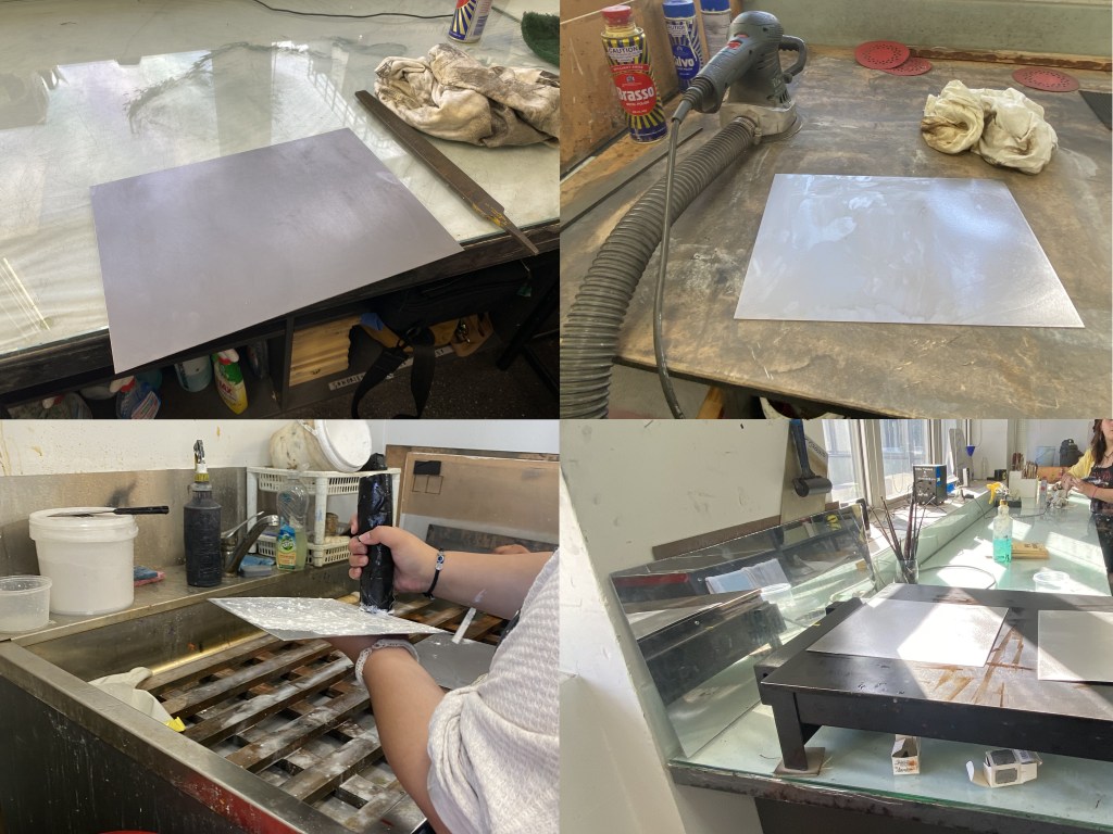
In the second process, using the other metal sheet given, we cleaned and applied the blue vinyl wrap. I printed a picture on a A3 transparent sheet in greyscale. Using the machine, we place the sheet and metal inside, making sure the numbers on the machine process are:
1. 35
2. 140
3. 0000
These are the numbers of the time. When I closed it, we need to lean on it to make sure the dial is moving. After the first round done, we take away the transparent sheet and the blue vinyl on the metal sheet. We then put it back in the machine for the second round.
Once this machine process is finished, we place it in the water for 10 minutes. Using a sponge we gently rub the blue side of the metal sheet.
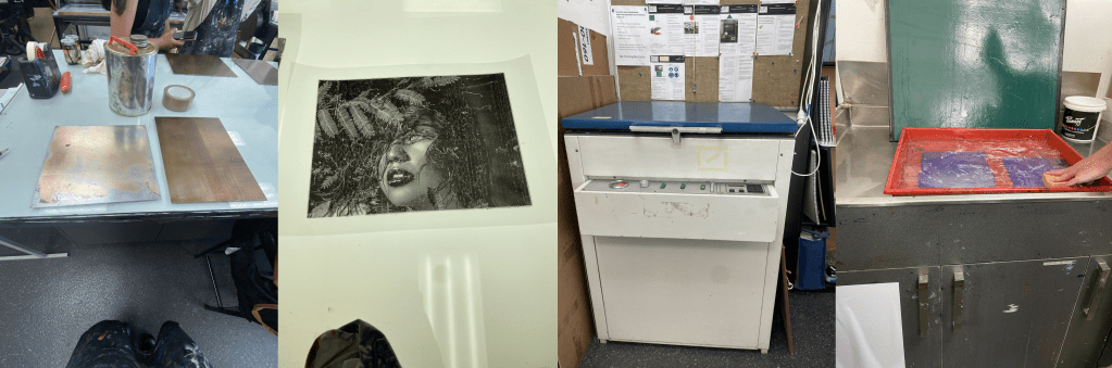
Next, I took it to this room and water blast it. I then wiped it with vegetable oil and solvent.

Combine
20.03.23
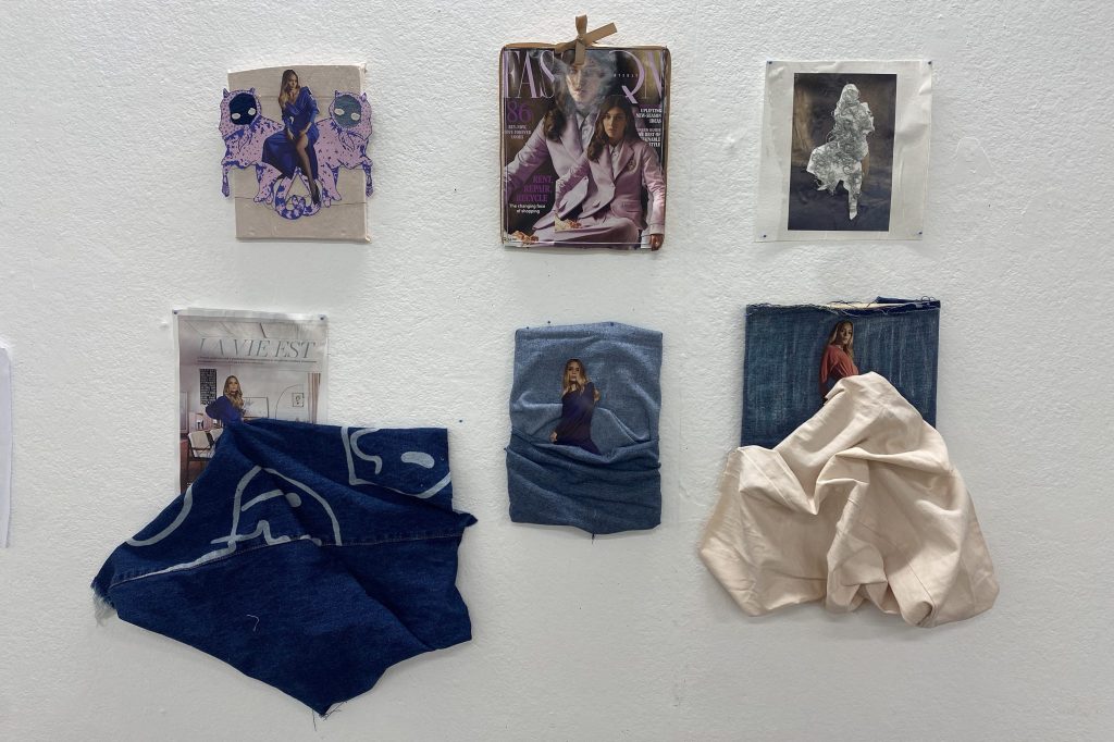
After our group discussion to everyone’s works. I decided to experiment with combining fabric material and prints. The base of my works are wooden pallets. Playing with the fabric, I crinked or pleated it.
The top right artwork stood out. I cut out a figure from a magazine but used the background. It gave an empty negative space to the work. What was interesting was I used ripped out string from denim jeans. I decided to try expand on that.
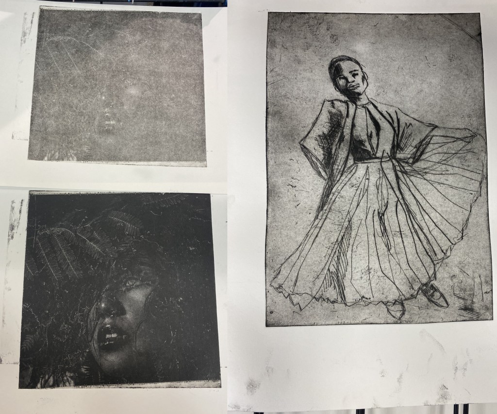
Printmaking workshop continuation
21.03.23
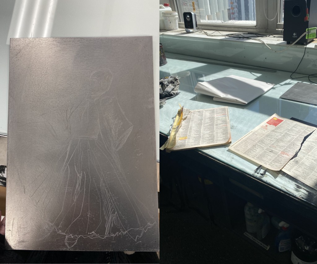
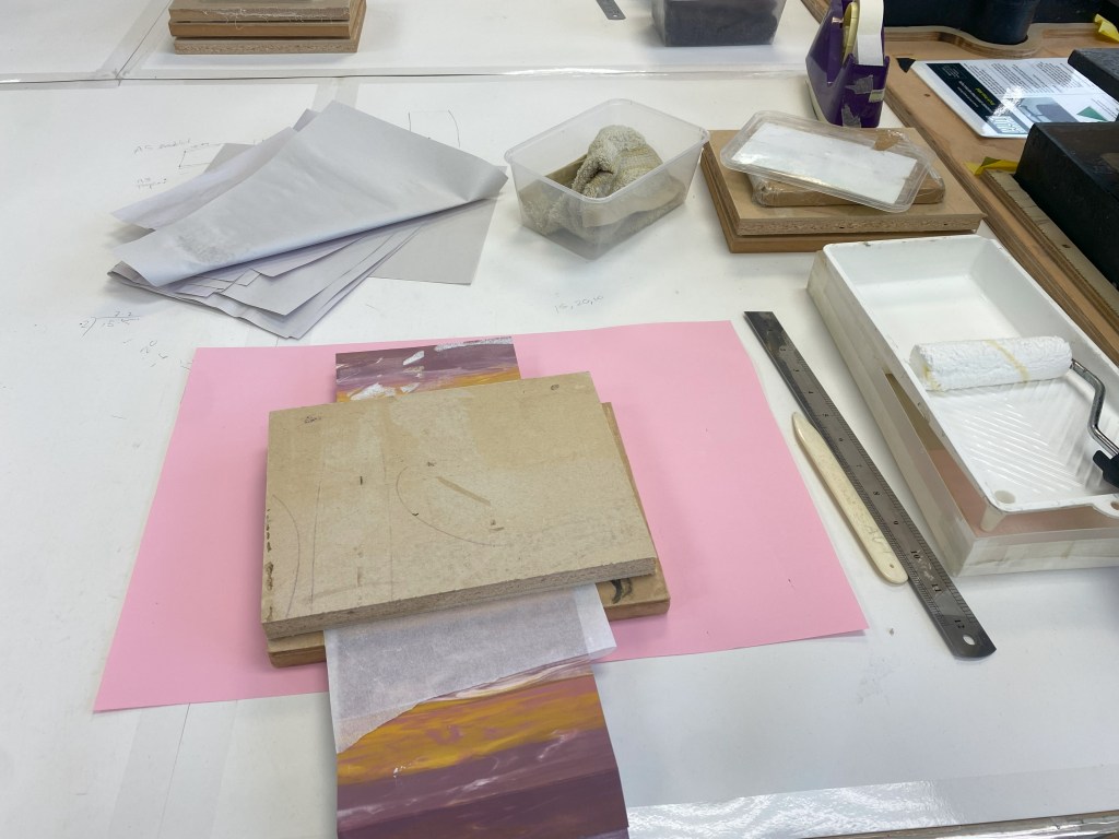
The following week, I went back to the printmaking workshops and continued both processes: drypoint etching and film print.
After etching the metal sheet with a pointed tool, I spreaded ink on the surface using a square rubber block. Once the ink is evenly spread, I started removing the ink with various materials: yellow paper, rags, and tracing paper. Using the etching printing press, I printed this work out.
I first stuck on red vinyl to the back of it. Next, using safety glasses and gloves, I placed the metal sheet in the acid bath for 30 minutes. Having to check up on it every 10 minutes, I used a feather to gently brush off little bubbles on the metal sheet.
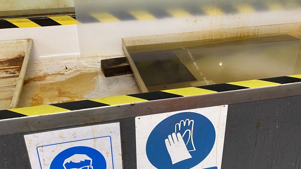
After 30 minutes, I washed off the metal sheet with water. Next I started doing the same ink process as the etching process. Here are both of the results:
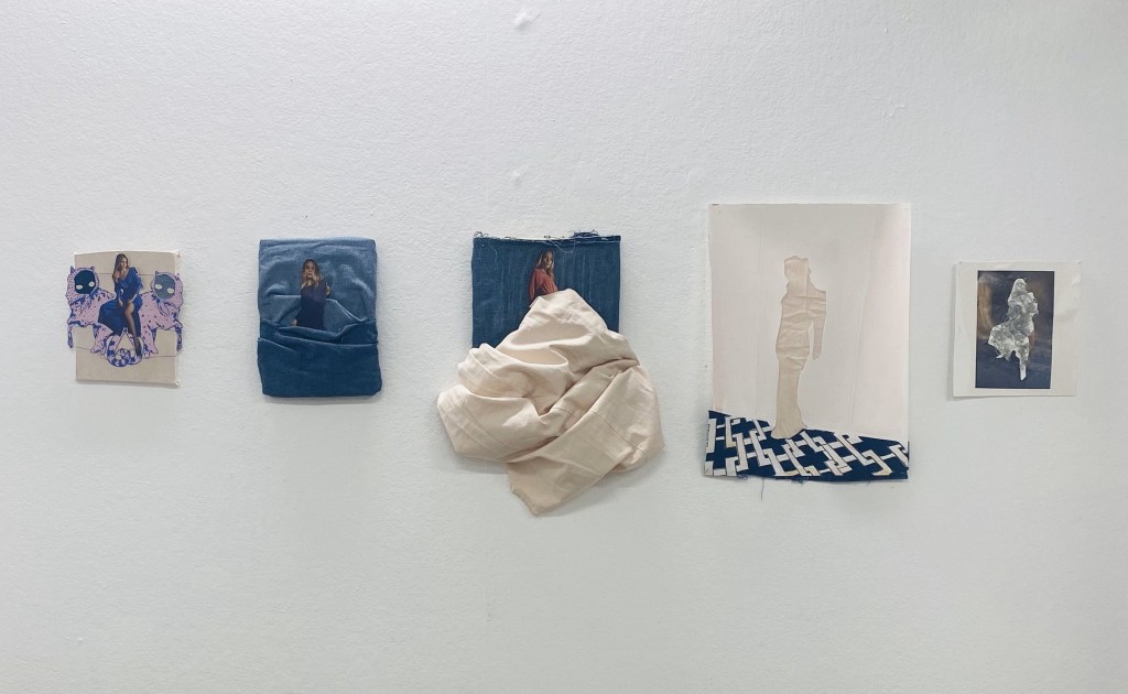
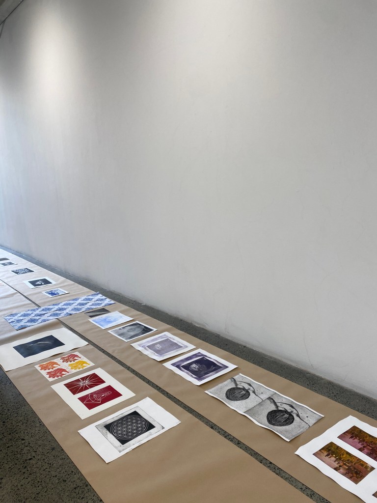
Open Studio
27.03.23
I set up my art works in my space. When I was told about this open studio, we were told that we just need to clean up the space and put things to the side. So I did that and made sure viewers aren’t leaning against a table to see my work. However, on the day, we were told to move away our tables with our materials. This resulted to my work display looking uneven.
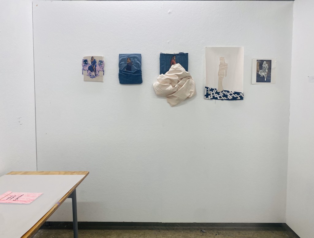
However, I received positive comments in my visitors book. A lot of people love the mixed media. There were compliments of my use of collage and fabrics. I would like to expand with the mixed media but would like to paint more.
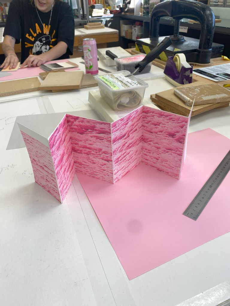
Bookbinding Workshop
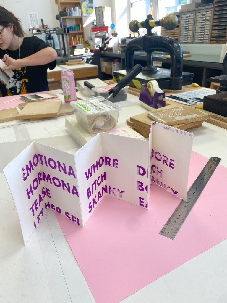
29.03.23
Two books
We first collected collected cut outs that was given to us.
We were instructed to fold the ends of each of the cut outs. Using the PVC glue, we glued the folded end parts. Pressing the work with the presser after being glued.
We were also taught using A5, we folded it using the folding bone. We glue each side to create two sides of the bending book.
‘gift, dialogue, and respond’ workshop
Colour Theory
04.04.23
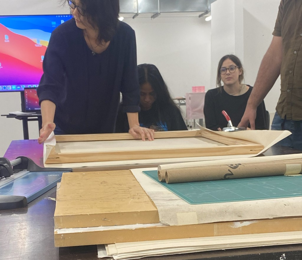
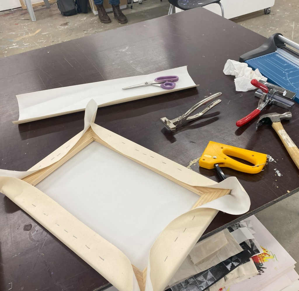
During the priming workshop, we were able to get a demonstration on how to make a canvas. This encouraged me to attempt making my first ever canvas. I enjoyed learning to stretch my own canvas.
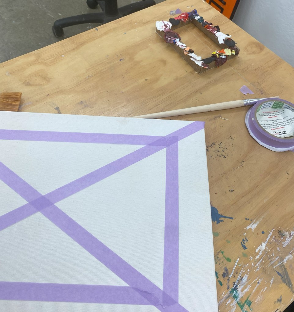
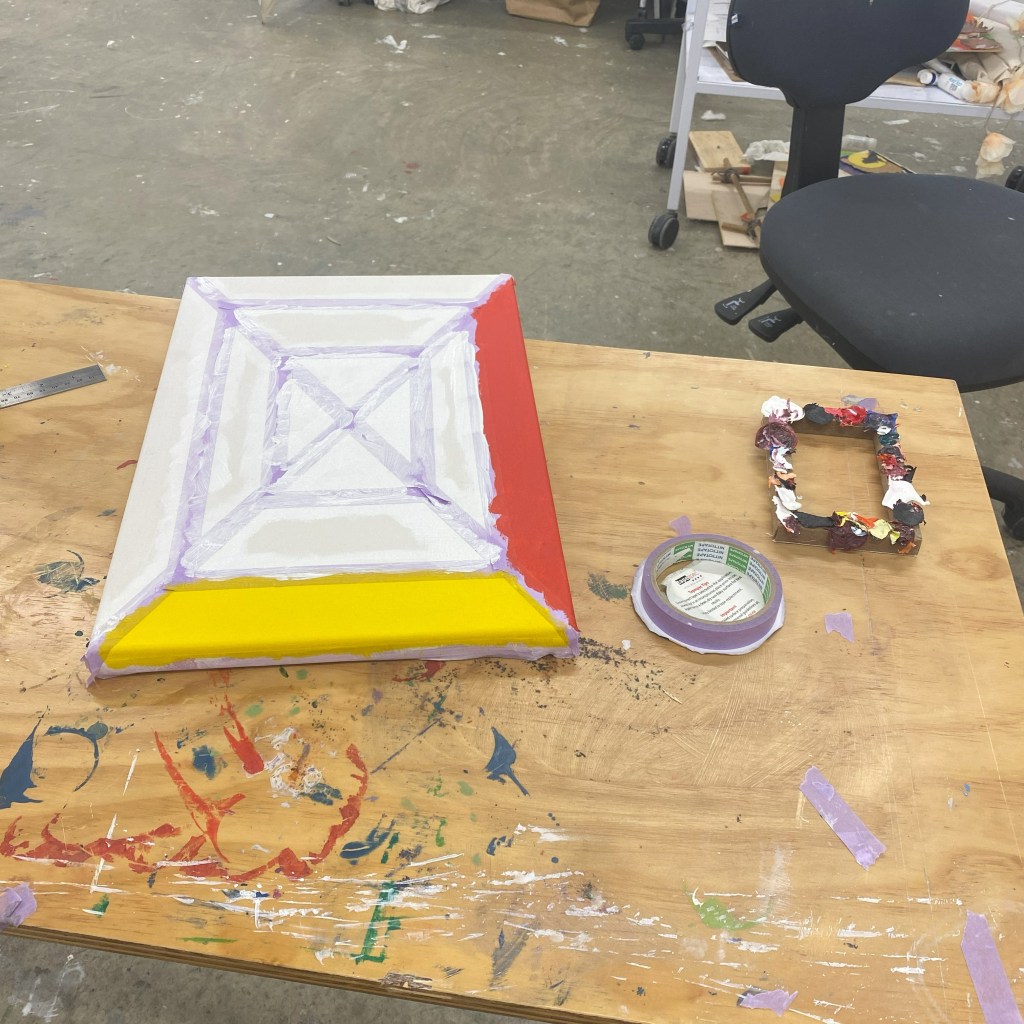
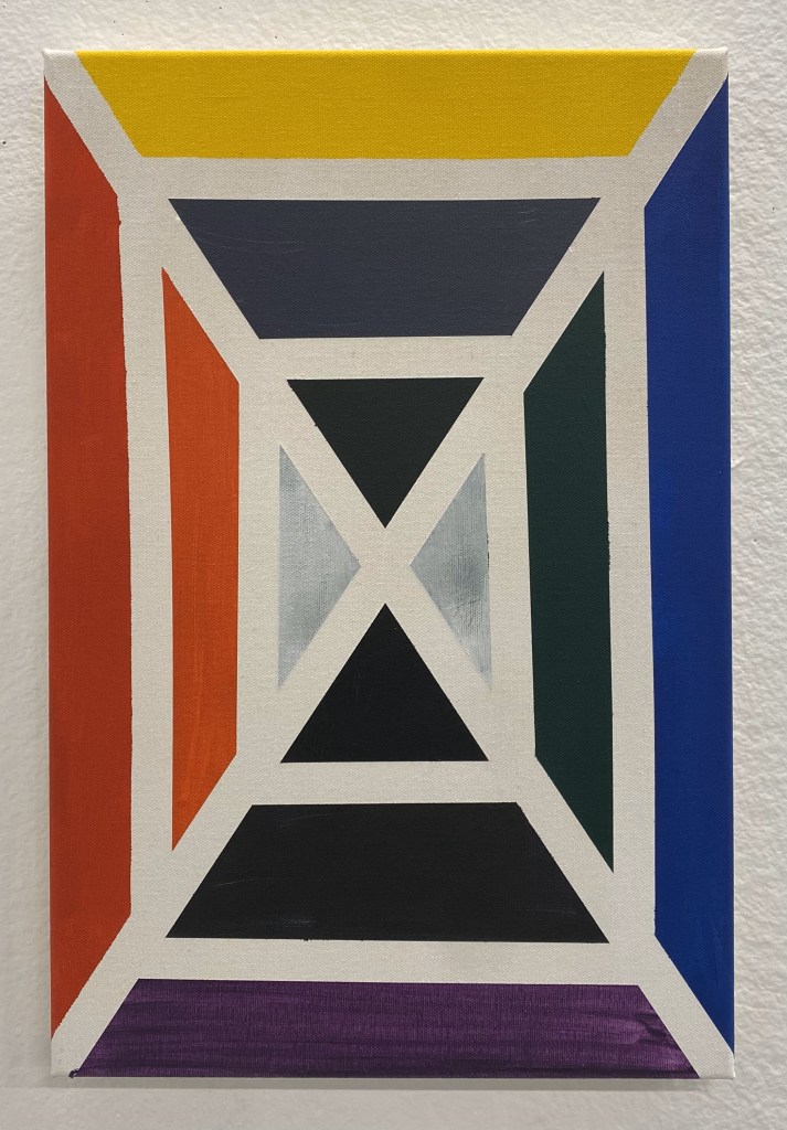
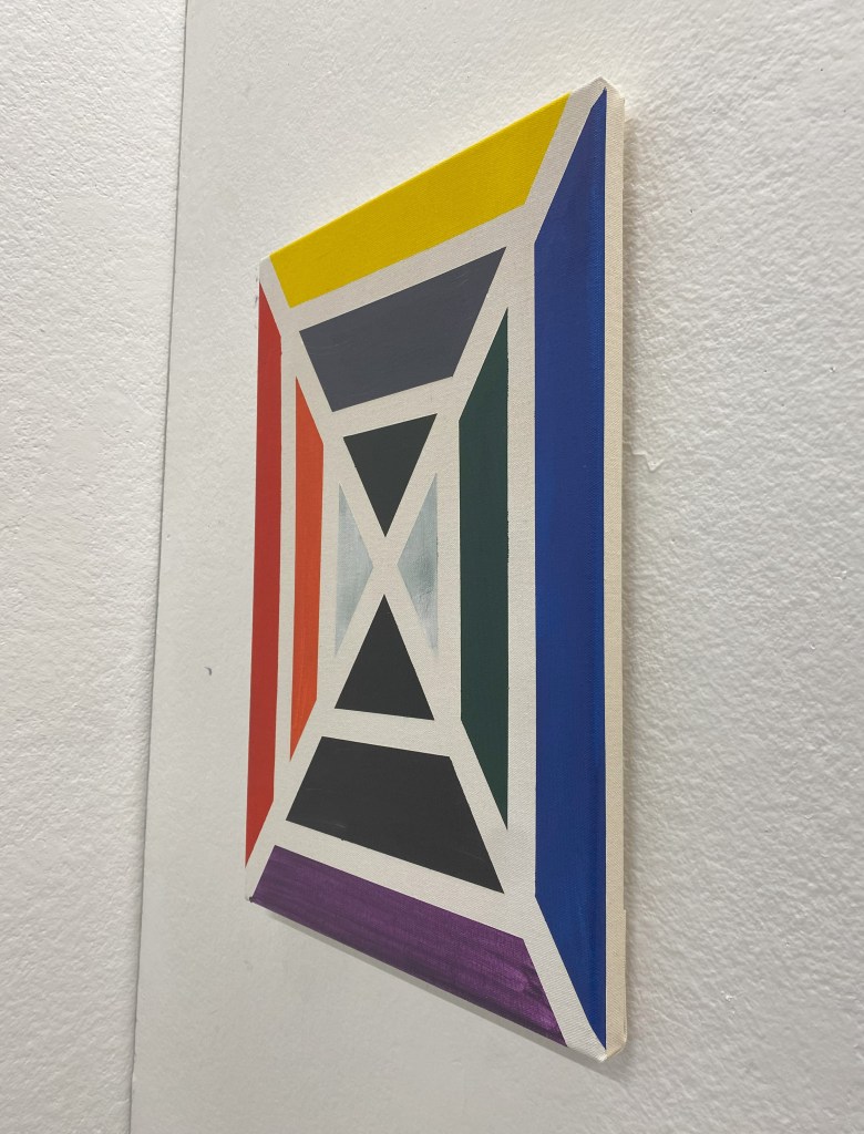
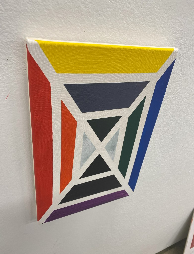
I was gifted a classmates artwork, talked about the work and responded to it by creating an artwork. Once I finished making my canvas, I decided to use some vibrant colours. When I saw her artwork of a frame with dried paint stuck onto it, my first thought was colour theory. I used primary, secondary, and contemporary colours. Having the opposite colours opposite from one another creating a structured relationship between each other. This piece gives a loud sound to the audience. From this activity, I want to experiment more with vibrant colours and framing.

airy thoughts
21.04.23
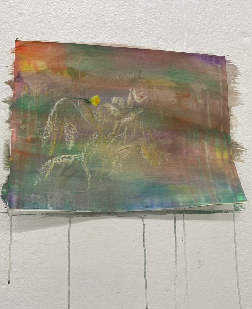
Inspired by Joseph Mallord William Turner, I used the brush technique to give an airy feeling. The colours are like thoughts in the background. Different feels of warm and cool colours. “[C]olor exists only through other colors. This is the basis for all color theories.” – František Kupka. I used gouache for a better blend with water and being more opaque. Using pastel to create a women figure looking away from the flower in her hand.
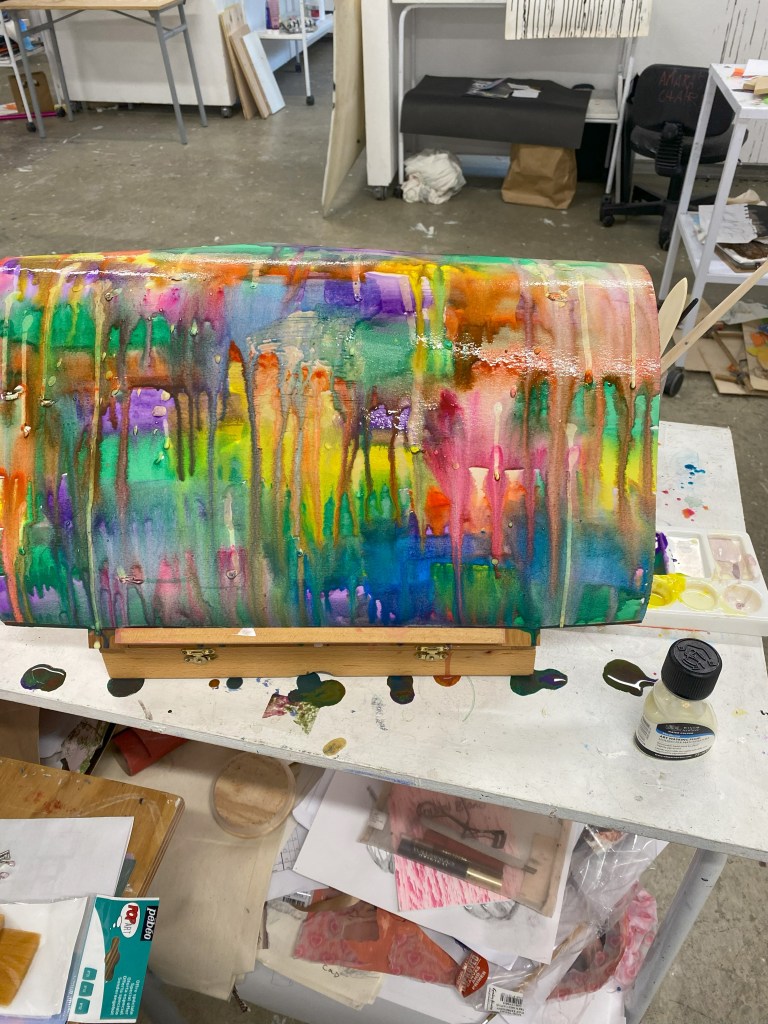
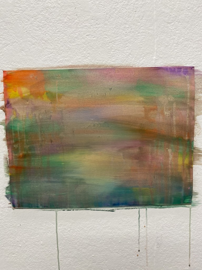
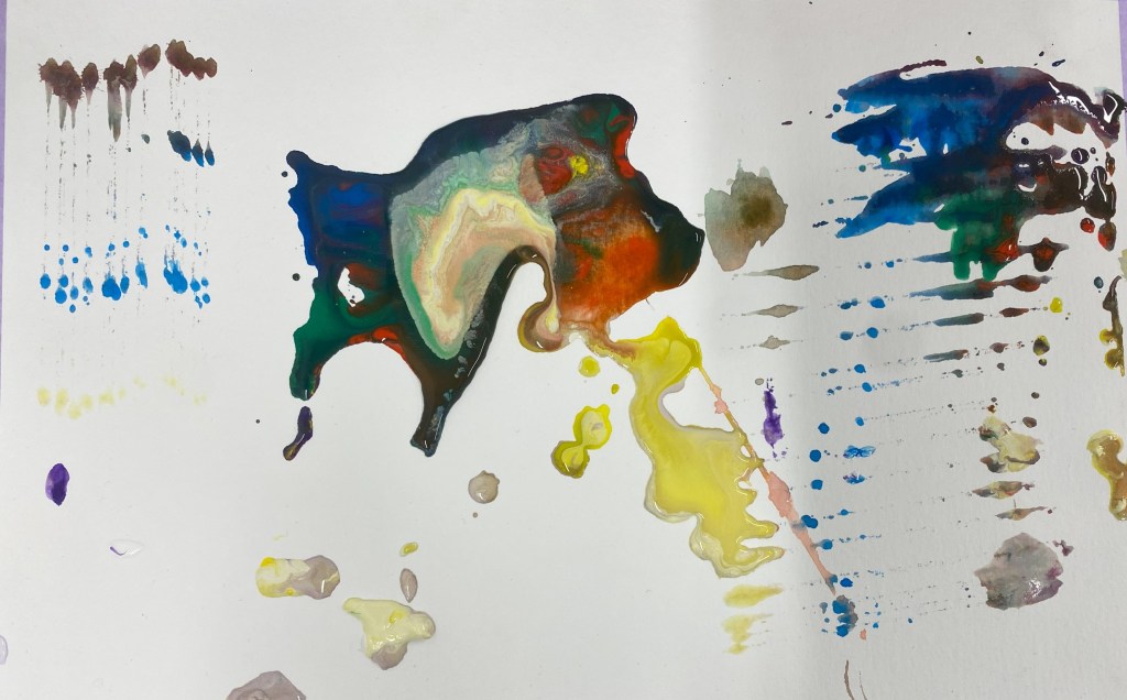
After this artwork I used the leftover gouache from the pallete to create this abstract piece mixed with the masking fluid I was going to use. I poured most of the palette into the middle with the masking fluid going down the work. On the sides are repeatitive the same colour going down the line like a list of generations. The masking fluid in the middle symbolises those who are going through the diasphora experience.
Blending in
01.05.23

From childhood to current, attending Filipino parties can mentally bring me down. It’s shameful how I don’t speak my native language. So this is me trying to blend in with the people around me. The change of thoughts and character to fit in my surroundings.
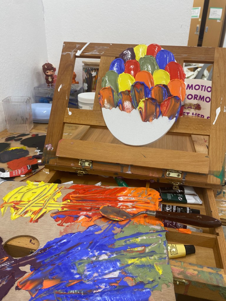
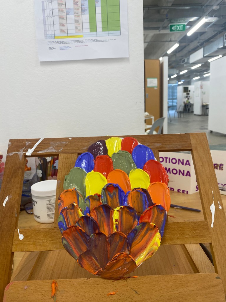
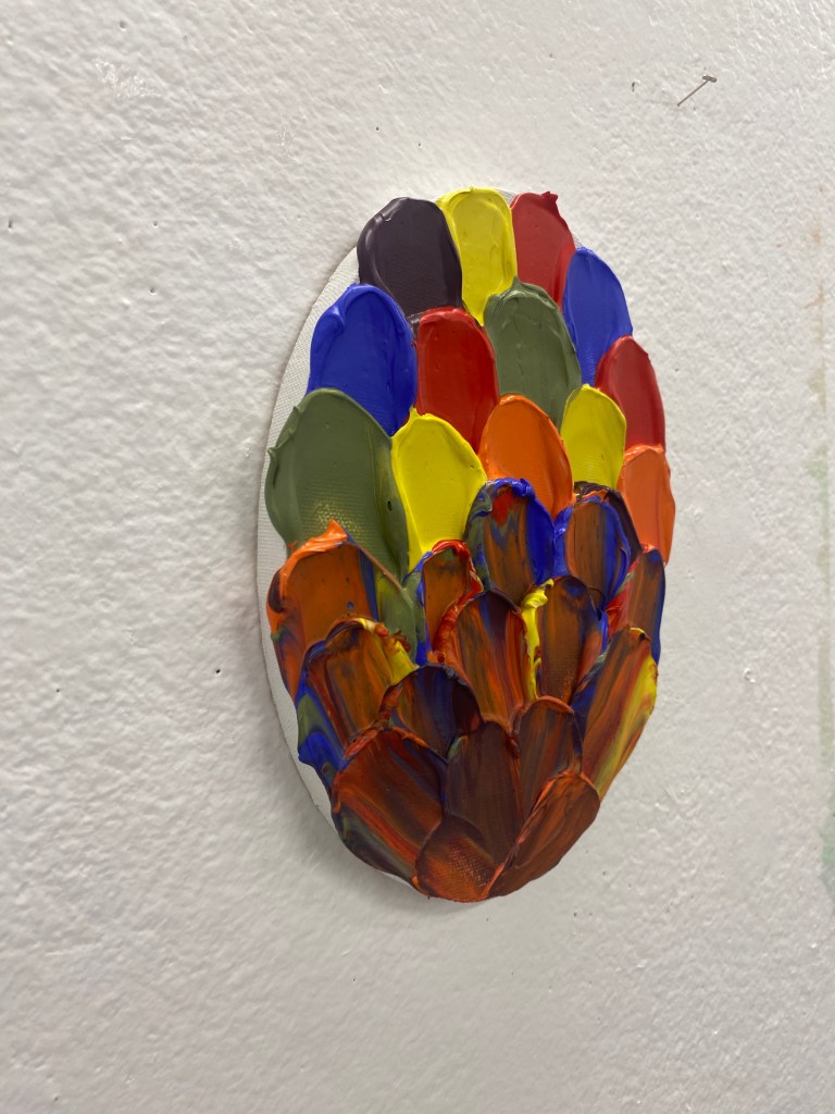
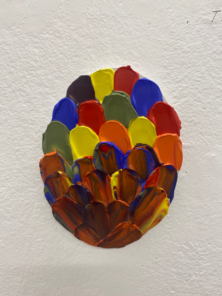
After Evan’s workshop, I wanted to experiment with the mediums he introduced. I mixed vibrant acrylic colours and heavy molding paste. I used a semi-circle palette knife to paste it onto the oval canvas. This palette knife created a round shape symbolising my thoughts and character.
disconnected
04.05.23 – 08.05.23
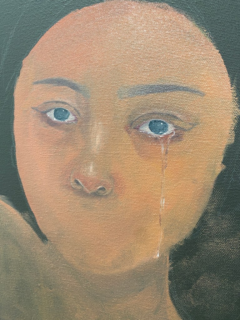
I’ve always been suggested to experiment with oil. When we were taught about oil painting in Evan’s workshop, I decided to buy oil paints. This artwork is my first oil painting. In this artwork, I wanted to portray the disconnectedness towards my heritage. This is due to not being taught my native language. When I’m surrounded by my Filipino friends or family, I feel guilt and shame for not speaking or understanding.
Y2 BVA P&P Foyer Exhibition
12.05.23 – 16.05.23
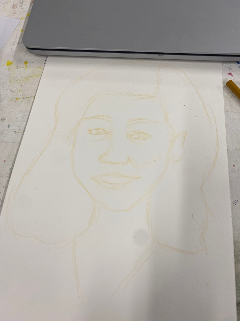
Rainbow screen glitch
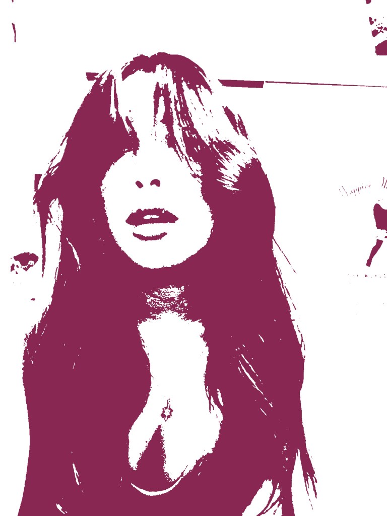
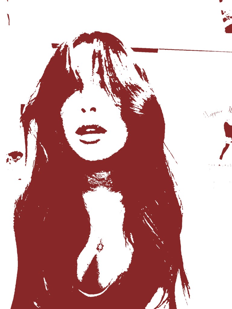

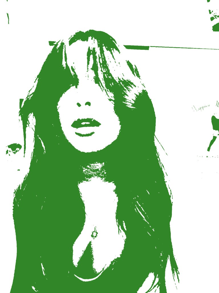

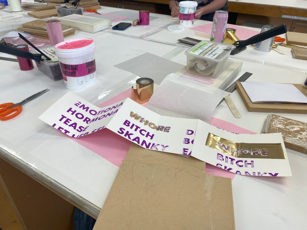
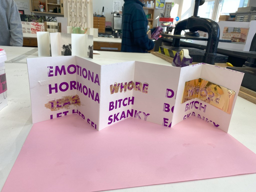
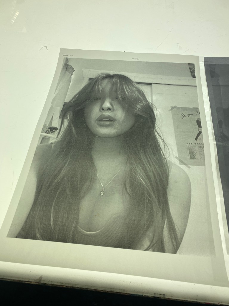
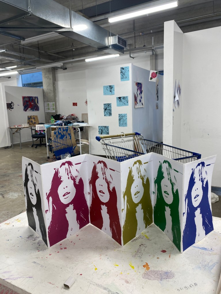
A glitch means an experience of a mistake or problem that stops something from working. I photoshopped this self-portrait by using the threshold filter and screen mode. I used this self-portrait because it shows as if I’m about to speak but I just remain silent due to the language barrier. I printed and glued it on one side of my blank bookbinding book.
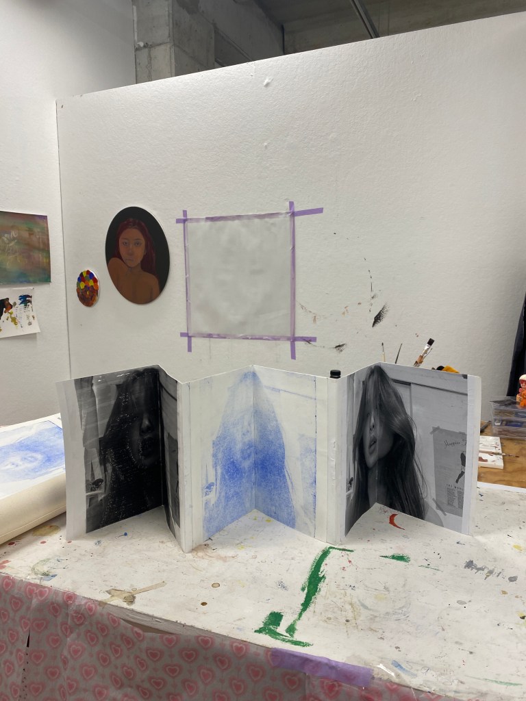
Noisy day & Noisy night
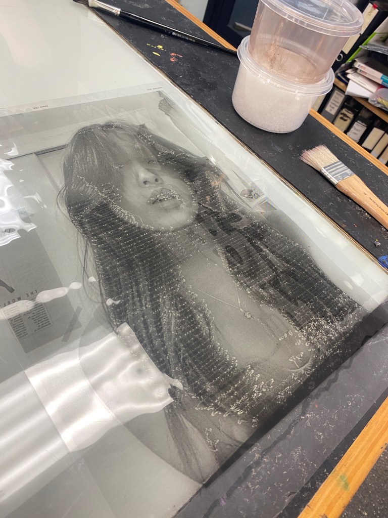
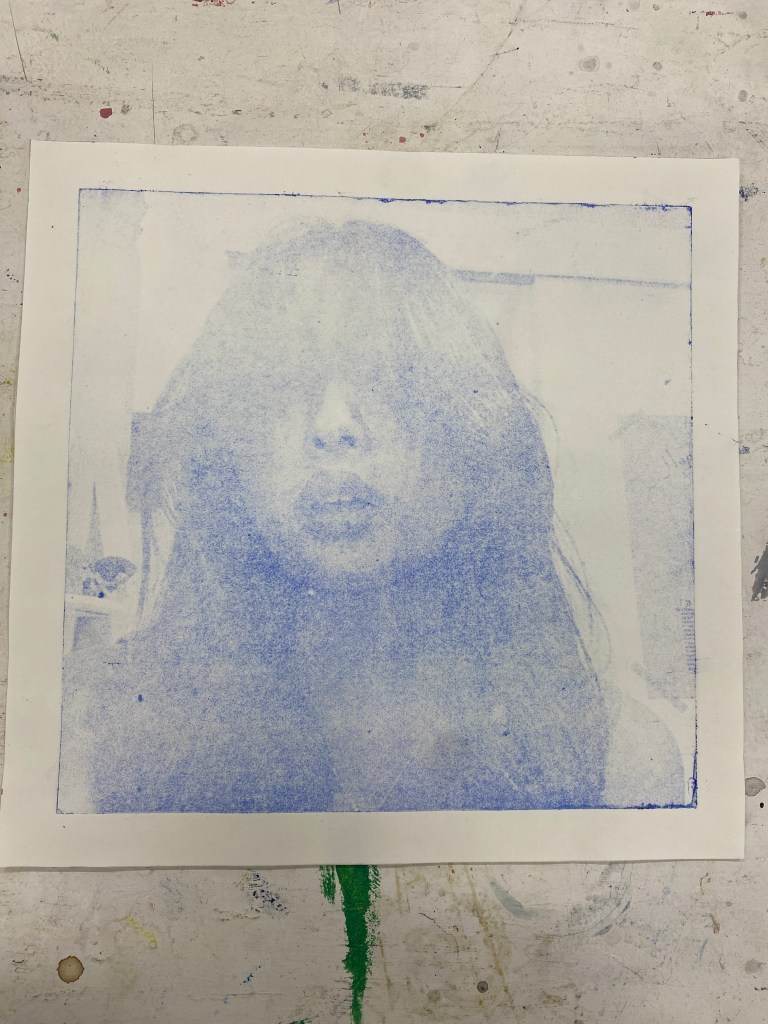
In the print workshop, we learnt relief printing. I decided to use the same image but the raw image in grayscale. The plastic sheet came out faulty but created the symbolising lines of generations I mentioned in my ‘airy thoughts’ post. The images came out faded. However, it created a noise affect. I decided to create a negative affect by not wide in he ink into the film. This gave a negative film look. It also came out with noise affect. This helps me portray the noise around me but yet I’m silent. I called the blue print noisy day and black print noisy night. One of the blue prints, the plastic sheet and paper prints were glued onto one side of my bookbind book. These work were displayed out in the foyer with all the year 2 Visual Arts painting students prints and books.

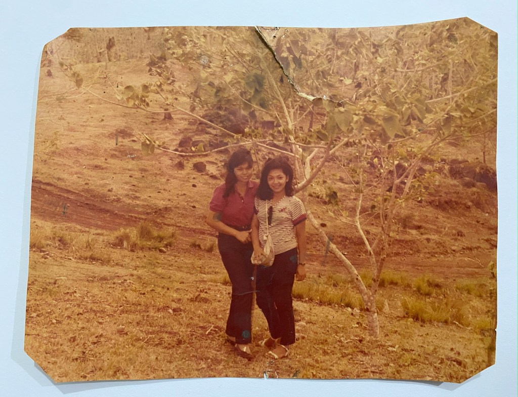
Built-in four eyes

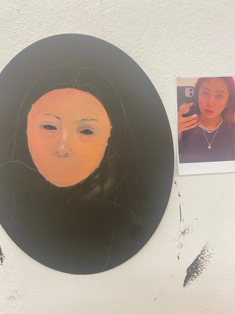
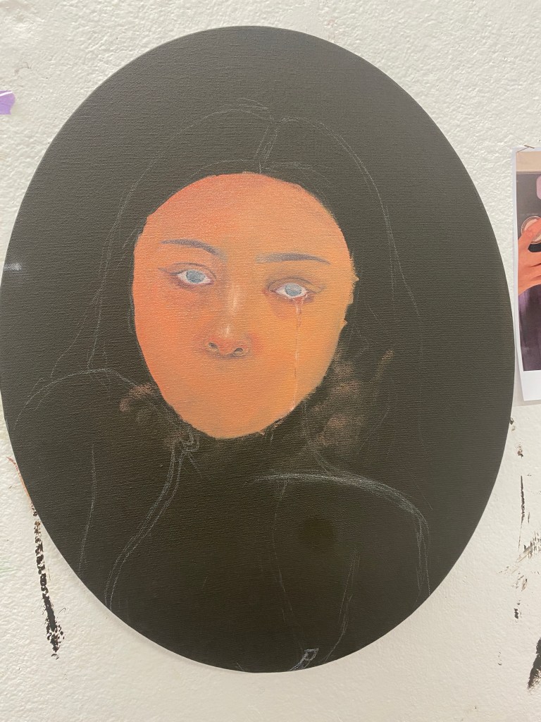
Inspired by Maia Cruz Palileo, I used one of my mum’s archive photos. It was her standing next to her friend with sunglasses on her shirt. However, I changed it to having her sunglasses in her eyelids with the temple tips coming out of her ear. This represents the tint of knowledge, seeing and hearing the world more through language. As shameful it is that I wasn’t taught my native language. I envy those who were taught their native language. This means I have to teach myself which is more difficult.
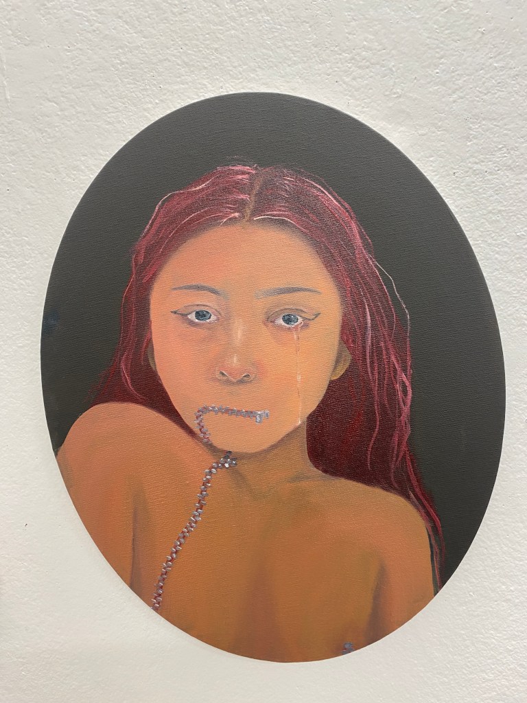
Invisible
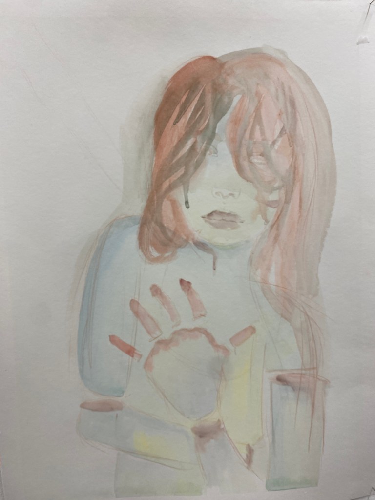
This work showcases my insecurities around my body. I have
eczema. I’ve mostly been pointed out and pettied in Filipino
gatherings. This is due to the beauty standards in the
Philippines that could bring people down with insecurities.
So I painted a self-portrait of me that is spiritual ghost like.
This gives off me wanting to go invisible.
Kiwi fruit
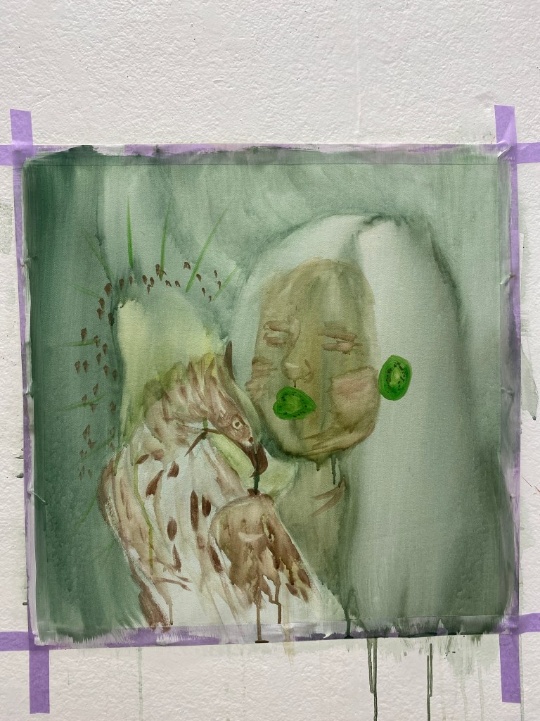
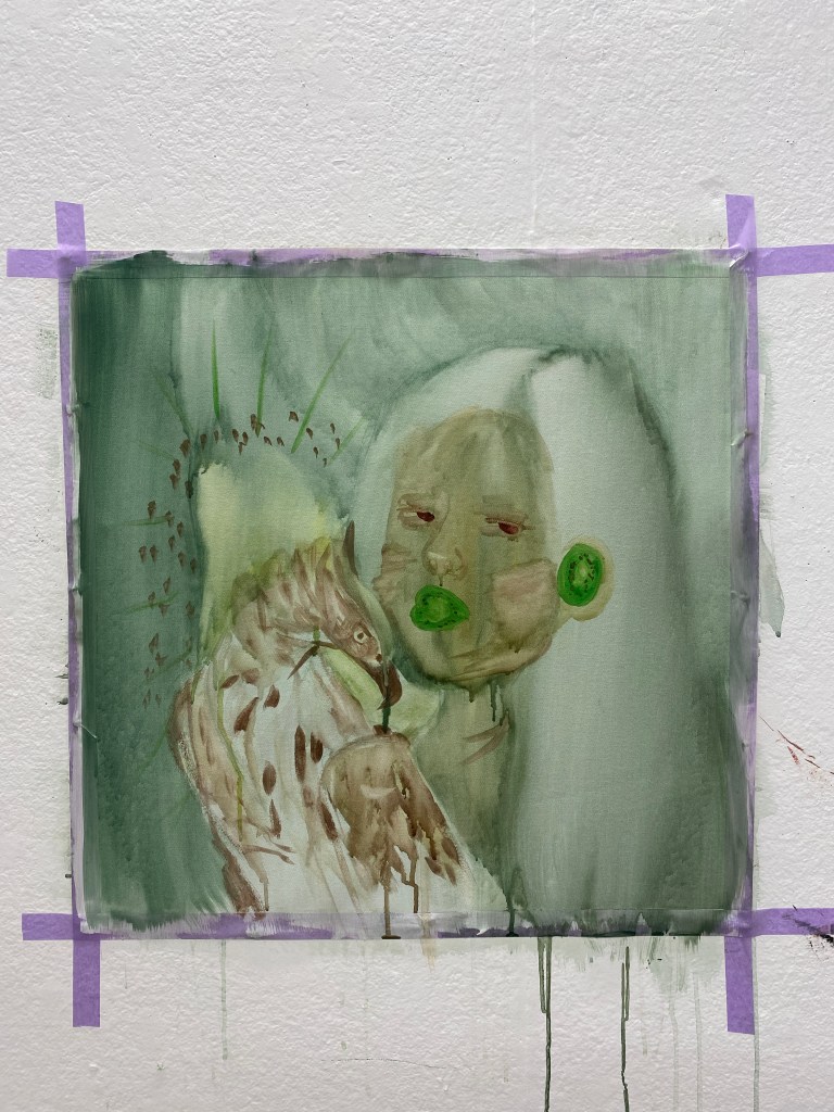
In this work, I was inspired by René Magritte and František Kupka. René Magritte surrealism work of figures with familiar objects in an unexpected representation. František Kupka used nonnatural colours for some figure works. The colour palette I used was like the kiwi fruit. I made it as if I was a kiwi fruit because I’m a Kiwi/New Zealander. I made sliced kiwi fruits as my mouth and ear. This symbolises me only speaking and hearing one language. Yet I have the Philippine’s hawk-eagle facing towards me. I’m leaning toward the Phillipine hawk-eagle. This portrays me trying to get to know my culture more.
